


5 tips on how to make your website more mobile friendly
Before we start optimizing your website, you need to determine how much your website needs to be improved. So, how are you going to determine how much your website needs to be improved? This can be done by using Google Mobile Friendly Testing Tool to test your website and see which parts of the website need to be fixed. This tool will also provide suggestions on how to improve the mobile device website. You can also use Google Analytics data to understand the types of mobile devices your website visitors use most often. You can then use this data to better optimize your website for certain device screens.
1. Optimize for touch screens

One of the biggest differences between mobile devices and desktop devices is their interaction methods. On mobile devices, people are accustomed to zoom in and swiping with their fingertips to view more content. Making your website design responsive is not enough to provide a great user experience for mobile users. You must also optimize your website for touch screens. This includes adding touch screen navigation to the website.
For example, you can make sure that the slides on your website can be swiped with your fingertips. Make the form (such as your email selection form) easier to fill out by reducing the number of fields in the form.
2. Compress HTML, CSS and Images

Making websites load faster is another important part of optimizing websites for mobile devices. You must make sure that your website loads fast enough to prevent visitors from getting frustrated, especially on mobile devices. Compress high-resolution images to ensure that your blog posts do not consume too much data on mobile devices. In addition, compress and minify the HTML and CSS of your website to increase speed by Installing a good caching plugin.
3. Choose The Right Font Sizes
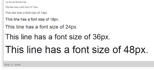
There are some of the most popular blogs still use very small font sizes, which can hurt our eyes when reading. Visitors can zoom in on your blog posts without just reading your blog content. This completely ruins the user experience. You can solve this problem by configuring the viewport to ensure that the fonts are rendered at the correct size on different device screens. This is a simple process, but you need some CSS skills to complete it.
4. Switch To A Better Theme

Since you are using WordPress, the easiest way to make your website mobile-friendly is to upgrade to a better theme. Just buy a modern WordPress theme with a mobile-friendly design and replace your theme with a new one just with a click of a button.
You can also use plugins to optimize your mobile device website. However, this method is not recommended, it will make your website load slightly slower. Until a permanent solution is found, it can only be used as a temporary solution.
5. Implement AMP

(AMP) is an open-source project designed to provide mobile users with a smooth web browsing experience. After the implementation, AMP will create optimized versions of your blog posts, which can be viewed on mobile devices in a matter of seconds. This makes your website load so fast that browsing a website powered by AMP is like using a native app on a mobile phone. Google also ranks AMP-supported sites higher in its mobile search results. You can easily implement AMP on your website using a free WordPress plugin.